On Wisconsin Art Direction

As art director, I have the opportunity to work with our great team of in-house designers and photographers, as well as freelancers from across the world. Below are some of our most memorable projects.
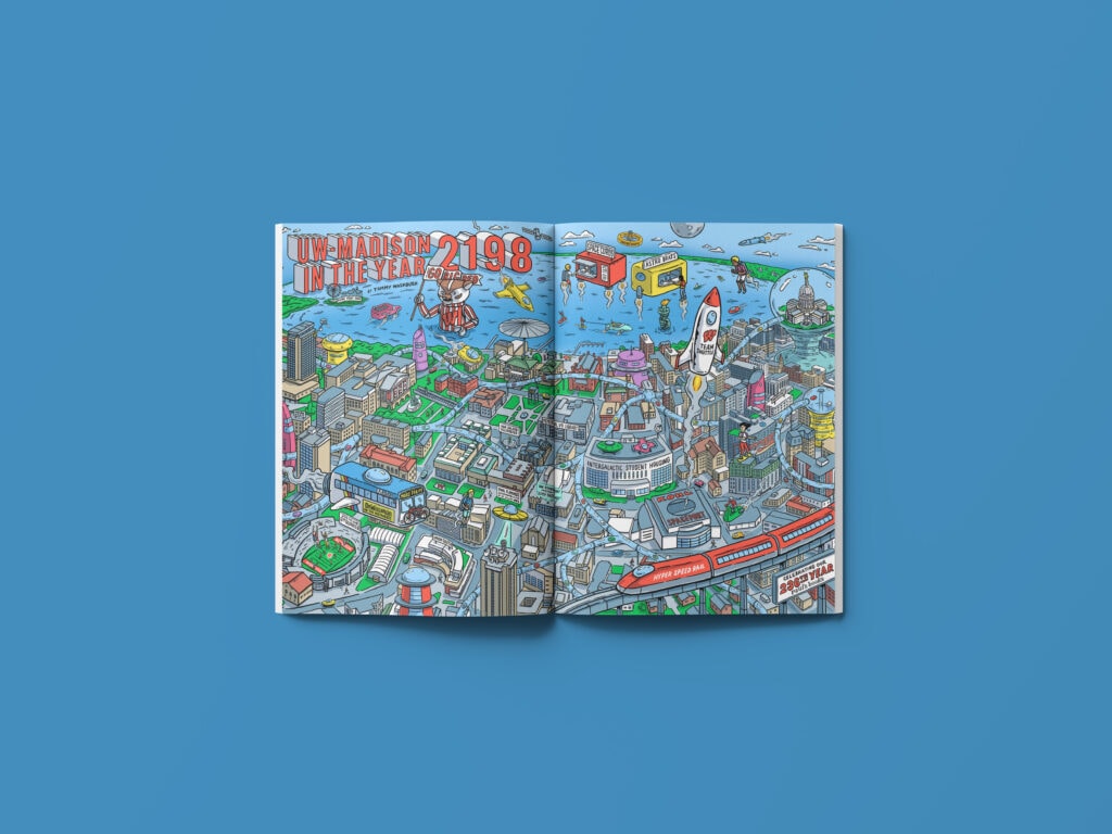
“UW–Madison in the Year 2198” is a two-page, full-bleed, centerfold illustration created for On Wisconsin magazine’s “Future Issue.” The issue marked the university’s 175th anniversary with several serious articles on innovative research that offers hope for the future. The illustration, conjured up by editor Dean Robbins was executed by Tommy Washbush and has fun with the futuristic theme.
“UW–Madison in the Year 2198” renders the UW–Madison of the future as a kind of brightly colored “Where’s Waldo?” cartoon that rewards close scrutiny. Every square inch contains silly and surprising gags, along with a hint of satire.
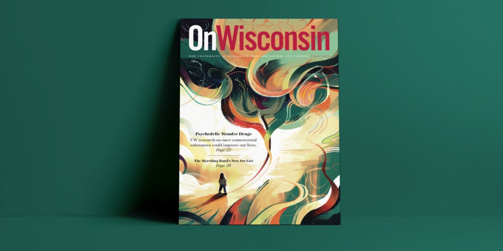
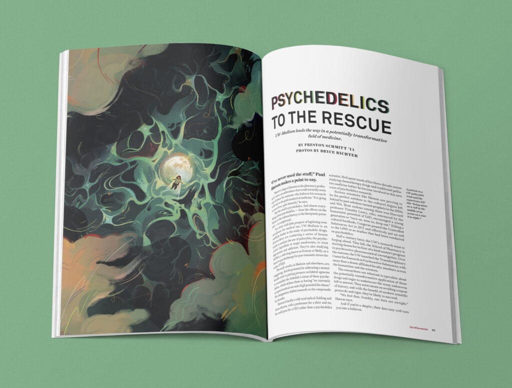
I enlisted the help of Mathias Ball to illustrate the cover and feature opener for “Psychedelic Wonder Drugs”. Together we were able to overcome the challenge of designing a cover with such a controversial topic. We had to approach this piece with a subtly that balanced the design from being too cliché and 70s-centric. The final result was a bright and whimsical design that carried through to the feature story inside.
My favorite way to describe this cover is someone looking inward and “examining their brain” which is what psilocybin reportedly helps an individual to do. “It essentially allows people to have more flexible access to aspects of their mind that they wouldn’t have in an ordinary state of consciousness,” says Christopher Nicholas, a clinical psychologist and assistant professor in the UW’s School of Medicine and Public Health. “It can lead to new shifts in perspective on themselves and the world around them.”
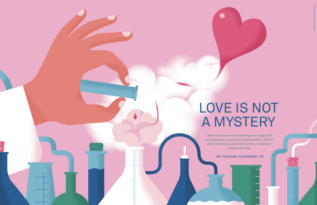
Giacomo Bagnara is a recurring freelancer for On Wisconsin. He has a one-of-a-kind style and is always able to execute my vision perfectly. Our first time working together was for “Love is not a Mystery”, a feature story that delves into the groundbreaking work of Doctors John and Julie Gottman. The Gottmans are highly respected figures in the field of psychology, particularly in the area of couples therapy and relationship counseling. Here, I wanted to pair the ideas of “love” and “science” and thought a whimsical “potion-like” laboratory scene could work well. Giacomo applied the same style and color palette to spot illustrations shown below.
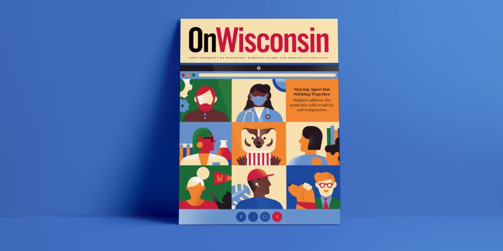
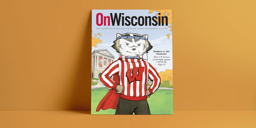
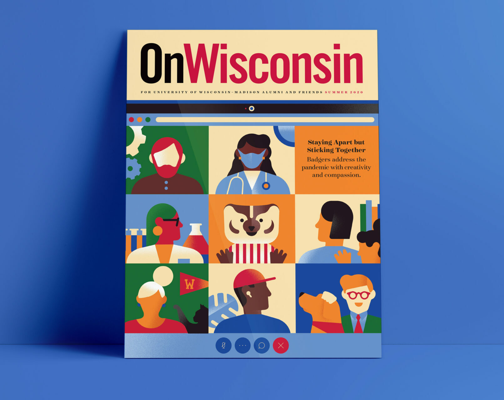
My second time working with Giacomo was when I hired him to work on our “COVID” issue cover. This was my first magazine as art director and was coincidently when COVID started. All magazine team meetings for the first time in its history were virtual. After being in several meetings on web conference platforms early on in the pandemic, I observed how personal our work lives all became. We saw inside our colleagues’ homes for the first time—kids appeared in the background, cats crawled across keyboards, dogs barked for a quick second before the participant could hit mute. I was inspired by this new way of working and drew up a very rough sketch of a web conference on a laptop screen. I thought it could be a relatable way to showcase how COVID affected so many of our lives while presenting different individuals in their various work/home settings. Giacomo once again nailed the execution by using rather simple shapes and an abbreviated color palette.
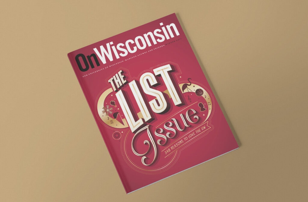
I was introduced to Bryan Patrick Todd at a Design Madison event that he spoke at. As he showcased his lettering-heavy work, I made a mental note to file him away as a possible freelancer for the magazine. Later that year, the On Wisconsin team decided to assemble its first thematic issue—”The List Issue”. I suggested the possibility of a typographic cover and we all agreed to hire Bryan to execute it.
